Outcome
By improving the alignment guides and introducing auto-alignment features to the editor, we reduced design abandonment and increased the number of users that are completing their designs by 22.68%.
Case Study
Context
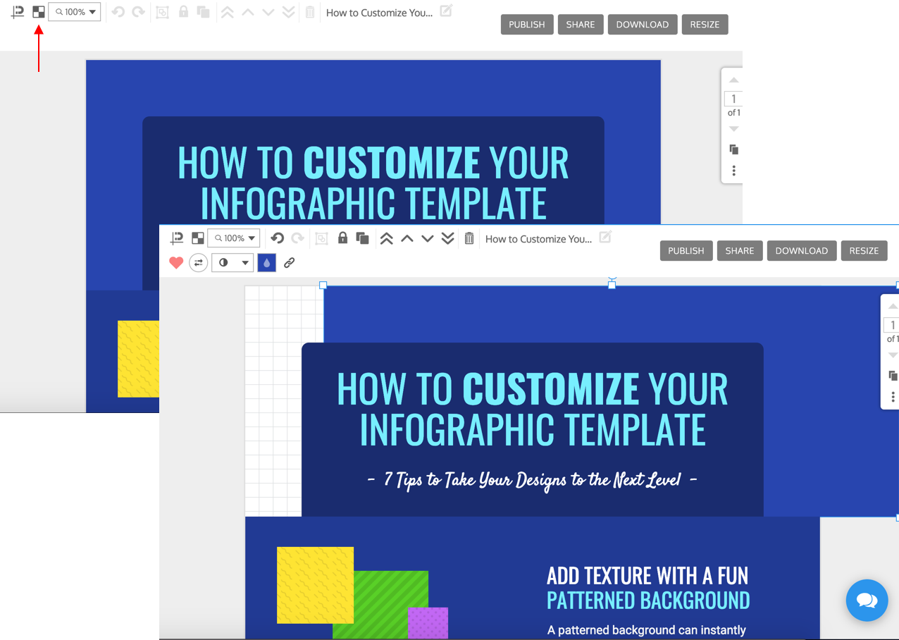
Venngage is a simple design platform that targets professionals without a design background to create stunning visuals to aid their communications. The tool offers over 8,000 customizable templates with a simple WYSIWYG drag and drop editor.
This project focused on addressing the pain points with the alignment features of the editor, which helped increase design completion by 22.68% after its release.
The Problem
The editor had two features that would help users align elements within their design.
The snap guides would show up on the canvas as you moved elements around, and the grid could be turned on to establish a set of guidelines for how elements should be positioned within the layout.
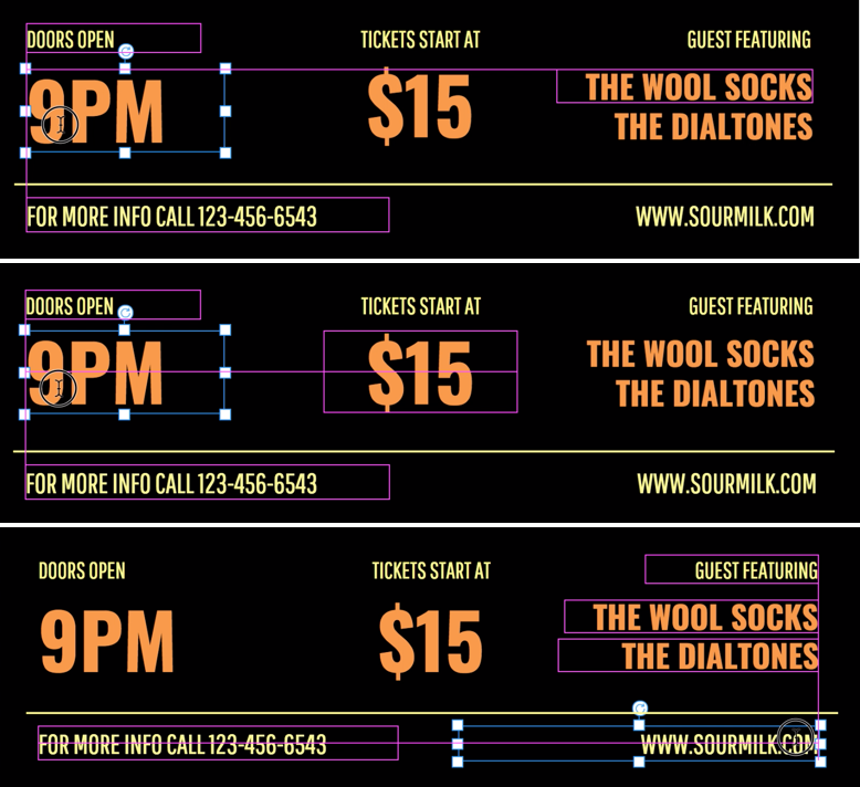
1. Snap Guides
.png)

As the text widgets are being moved around, the pink snap guides are showing a series of lines for alignment. However, they appear to show up randomly and it is unclear what the moving element is "snapping" to as it is dragged across the canvas.
.gif)
There is a lot of jittering and shaking when moving elements around, the element is trying to "snap" to two different guides at the same time causing this motion.
Users need to do a lot of guess work and eyeballing to properly align elements on the canvas.
A workaround that our in-house graphic design team used when creating templates was adding a rectangle to the canvas and using its sides as reference to make sure every other element is aligned. Once finalized, they would delete the rectangle from the design.
2. Grid
The main problem with the grid was that it did not overlay any elements on the canvas. It also did not allow for any sort of adjustments to its guidelines.
Many of our templates used shapes and images as backgrounds which made this issue more prominent. When users would turn on the grid for these templates, it would look as though nothing has happened.
The workaround was to lower the opacity of the elements in order to see the grid underneath.
User Pain Points
- Unsure what the guides were doing and why the alignment lines were showing.
"how do I get multiple text boxes to easily line up without moving each of them individually?"
- Trouble centering elements.
"Is there a way to center graphics/images in relation to the board?"
- Unable to make the size of elements the same.
"Is there a way I can see the current size of my rectangle, to make sure they are all the same size?"
- The grid does not show above shapes or images.
"The grids are on but do not show within a frame"
- Unable to automatically align and distribute elements.
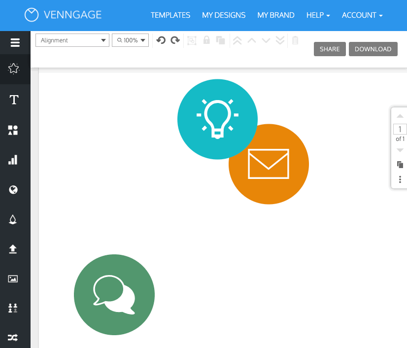
"I have 4 circles I want to evenly distribute on an A4 page”
Research & Discovery
- Reviewed user feedback gathered by our support team.
- Qualitative research - I playing with a number of our templates, and wrote down cases where our alignment features failed.
- Conducted 7 user studies - I gave users misaligned templates and asked them to align specific sections. My goal was to observe which aspects of alignment caused the most problems.
After listing out all the problems with our current alignment features — I did some competitive analysis of other design tools. I looked at tools like Canva, Infogram, Piktochart, Sketch, Google Slides and Adobe with our users in mind — Low design proficiency.
.png)
Exploring the problems
Goal
The goal of this project was to 1) increase the number of users who are completing their designs and 2) reduce the time it is taking them to complete their designs.
We were going to do this by :
- Improving the functionality of the guides
- Introducing auto-alignment & auto-distribute features
- Changing the grid positioning
Solution
PART 1 : Improving the guides
1) Narrowing down the 'snap' range → This would reduce the shakiness that occurs when the element being dragged is trying to snap to two different elements at a time. One would be chosen over the other for the dragged element to ‘snap’ to.
2) Showing bounding boxes → This would let users know what the guides are aligning the selected element to.
3) Showing guides when resizing → Indicators will appear when elements are resized to have the same height and/or width.
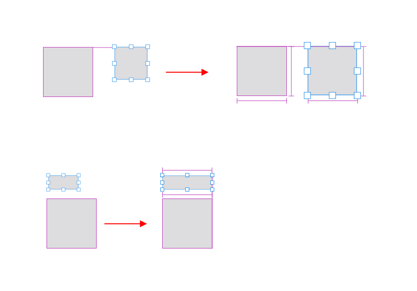
4) Equal space indicators → If three or more elements have been aligned and you drag one of them around, you’ll be shown equal spacing indicators to let you know when your elements are an equal distance apart.

5) Green Indicators for center / middle / edge alignment to canvas → this would help distinguish when a user is aligning elements to the canvas as opposed to another element.

All of these improvements will help the user easily align and distribute their elements without having to eyeball or do any guess work.
.gif)
Bounding boxes are visible / Resize indicators
.gif)
Equal space indicators
PART 2 : Introducing auto-alignment & auto-distribute features
Auto-alignment features are a must have for any design tool, and they require the multi-selection of 2 or more elements.
Most of our users did not know how to multi-select elements based on my user calls and user testing. Therefore, we had to make sure there was adoption on how to actually use these features.
We added 2 in-context guides :
- Tool tip #1 → the first time a user engages by clicking on the alignment dropdown — the tool tip would go away once the user has engaged with the feature.
- Tool tip # 2 → the first time a user clicks on the disabled distribution features (which will occur when less than 3 elements are selected).
Another way of making this feature more intuitive for the user was thinking about the icons that they were going to see when they opened the dropdown.

When a single element is selected and the user clicks on the auto-align features, the element will be aligned to the canvas and thus the icons in the dropdown reflect that.
When multiple elements are selected the icons change to let the user know that the elements will be aligned relevant to each other.
The distribution features will only be enabled when 3 or more elements are selected.
Demonstrating the auto align / distribute features
PART 3 : Grid Positioning
Some users have grown accustomed to using the grid, therefore as a simple improvement we enabled the grid to show on top of all elements, so that it is visible at all times on the canvas.
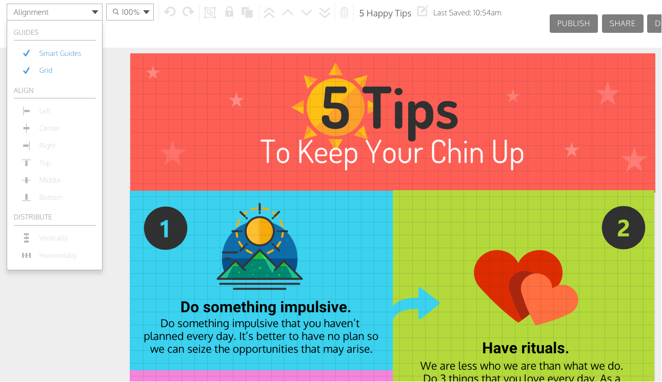
We also consolidated all alignment features under the ‘alignment’ dropdown.
Results
Design Completion
We increased the rate of completion within 1 day. Completion is defined as users having downloaded, shared or published their design.
- Register → Design Completion (new users)
- Increased by 22.68% a week after release
- Design Creation → Design Completion (in specific categories)
- Featured templates → Increased by 12.56% a week after release
- Infographic templates → Increased by 41.42% a week after release
- Layouts → Increased by 19.04% a week after release
Time to Completion
I conducted user studies, where I gave users misaligned templates and asked them to align specific sections. I looked at the time it took for them to complete these tasks using our alignment tools.
- Baseline before improvements → 19 minutes
- After improvements → 11 minutes
Overall, the changes that we made enabled users to design much quicker thus reducing the time to completion and increasing the % of users that are completing their designs within 1 day.
.gif)


.png)
.png)
.png)
.png)